Picking Kelly Moore Colors5/4/2011 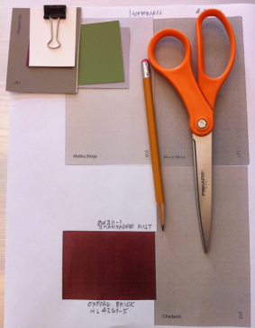 I like picking colors for buildings. You can only hide flaws so much, but if the basics are there, color can really enhance an already good design by directing the eye to a good feature and gloss over less desirable features. Many people think this is easy, but then most people can hammer out chopsticks on the piano as well. These are Kelly Moore paint chips. Local painters seem to like the brand and I like them because they are locally made in the Bay Area. There's a range of paint quality available. Most of the cost of painting is in preparation and labor. I wouldn't skimp on paint. Most paint manufacturer's can color match pretty much anything. If you like the orange on the pair of scissors above, they could match it.
0 Comments
Sitting in the SOMA Shadow4/30/2011 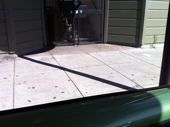 Here's another accidental photo on Folsom Street. Sitting in my VW at Vega Cafe, I notice the diagonal shadow of a post on the sidewalk. I snap the picture and look at it. The different elements in the photo connect with one another. The shadow on the window sill of the car merges with the diagonal line and then again merges with the shadow of the building leading the eye back for forth. The building green recalls the green of the car. Not a great shot, but enough to think about for a bit. Bar Agricole, San Francisco - Walking by4/28/2011 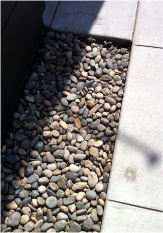 Located next to Slim's Nightclub in SOMA, Bar Agricole, 355 11th Street, San Francisco is the hot new place - both from the design and food aspects. Haven't been there yet, but it looks pretty interesting. In its previous incarnation it was a plumbing supply warehouse, very down to earth and gritty.
Now it's polished up quite a bit. I like the simple details like the stones here separating the fence and sidewalk. Designer's Dilema4/27/2011 1959 was a year of optimism for America. The space age was new and everything reflected rockets taking off to the stars. The landing on the moon was less than 10 years away. 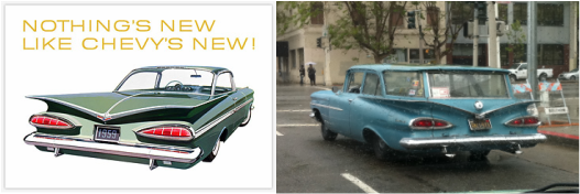 This ad on the left is how I remember the 1959 chevy, viewed from the rear as it left you standing in a cloud of dust, sleek and alluring. I saw this 59 Chevy stationwagon as I was crossing Van Ness at Fulton Street. Detroit, in their rush to design something new every year, was so taken with the design of the Chevy coupe, they really didn't think through how it would look as a station wagon. Here it is or was -- a box stuck on a rocket. It's survived all these years. Maybe nobody wanted to drive it much? The Bay Guardian vs SF Weekly4/21/2011 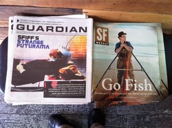 In the battle between the two San Francisco free weekly papers, there's no question my loyalty is with the Bay Guardian. I have a long history with them dating from 1977 when my office was in the same building .
I happen to see the covers of the two papers side by side when I was getting my coffee this morning. No question who is winning the battle on the graphic design front. Sorry Bay Guardian. Best Logo of 20104/21/2011 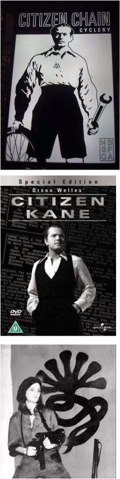 And the award goes to . . . . Citizen Chain Cyclery! One evening last year I was walking through North Beach San Francisco came across a closed bicycle shop. This sign in the window was back-lit and glowed on an otherwise dark street. Starting from the alliteration of the store name, the powerful image rendered in black and white recalls so many things on so many different levels. It evokes nostalgia of earlier days and what many people consider one of the greatest movies of the 20th Center, Citizen Kane. There's the San Francisco connection as Citizen Kane was modeled after the infamous publisher William Randolf Hearst. There's also a distant bicycle connection in the movie that you will find if you look at the Citizen Chain Cyclery website. The NB SF CA letters on the lower right hand corner reminded me of seals on Chinese paintings and prints. The guy stares straight at you, his head partially blocking the store name - even more powerful than the movie poster. Is this an invitation or a challenge? Is he protective or welcoming? The clenched hand around the wrench looks like a weapon. Speaking of weapon, Patty Hearst of SLA fame is William Randolf Hearst's grandaughter -- another iconic image. Ahh there are so many questions! I really didn't take a survey of logos, but this is one of my favorites. The folks there are pretty cool too! Design as Dessert4/19/2011 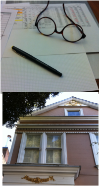 Tuesday 8:00 AM financial meeting today at the office. These monthly meetings aren't too exciting, but they're needed to run a Design firm.
As a student, it was design, design, design. Now I know you can't spend all your time designing. Design only represents a small percentage of time you spend in a design firm. I think of design as dessert after dinner - a treat after the basics. If we pay attention to the basics, we can have a treat. After the meeting, I worked on a new color scheme for this home in Pacific Heights. Much more fun! AuthorCatagories
All
Archives
October 2020
Blogs I follow
|
 RSS Feed
