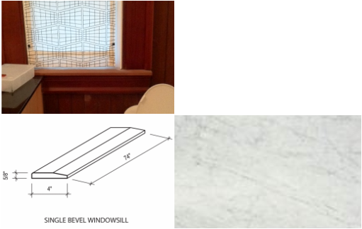
 The window sill There's a very unhappy meeting of the window, counter and window sill in the exisitng bath. The "robust victorian" casing around the window is about 6" wide with a corresponding 6" apron below. I just saw that Daltile makes a pre-fabricated beveled window sill in various stones including carrera marble.
I had considered just having the window sill fabricated from left over pieces from the countertop and that's what we may still do. Horizontal surfaces, particularly in moist areas like a bathroom are probably better served with a non-organic - easily washable surface. Since we're thinking of using carrera marble on the countertop, it could simplify and improve the meeting of materials. I'm also thinking of removing the wood casings and apron in a move towards a more consistent sleek look. The contrast between old and new that we had attempted before did not work out as well as it could.
0 Comments
I'm using Google sketchup to explore ideas. Its a great free modeling software product that many people including architects are using. 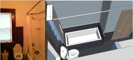 Right now the tub is set against the left wall and there is a low platform at the right end of the tub (not visible). It is tiled in white and has become a catch-all of clutter and ugly grout. The curtain rod is suspended from the 11' ceiling -- all in an attempt to recreate an original victorian feel. We wanted to keep the tub from feeling too enclosed so we are not using a shower enclosure. I wanted to eliminate the platform so my first thought was to furr out the wall to meet the tub but that made the area seem constricted. Furring out the wall at the toilet end seemed a better option to eliminate the platform. I thought using a darker tile platform to set the tub in place would minimize the ugly grout issue. Finally, I wanted to eliminate the suspended curtain ring. The wall receiving the curtain rod at the foot of the tub does not extend far enough out to receive the rod so this rod bends back to the wall. Pre-fabricated shampoo niches are made by Tile Redi, Noble Niche, and others. I haven't used either product so this is not an endorsement. 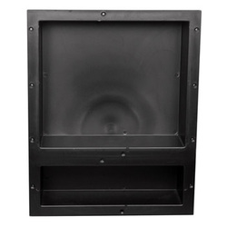 Minimizing the clutter of bottles is a good thing, particularly if everyone has their own special product. Traditionally these niches are hand fabricated on-site by the installer or a ceramic soap dish can be used. The ceramic soap dish is usually too small for anything beyond soap and it can be kind of clunky visually. Now there are prefabricated units that can be recessed into the wall and the ceramic tile can be installed over it to form a continuous tile surface of the same material. Theoretically this should have a better waterproof seal as there are fewer exposed joints. I wonder if there is even a better way to hide the clutter? The Minimalist Aesthetic4/11/2011 Mies van der rohe's famous quote, "less is more" has intrigued architects for most of the 20th century and he is considered a foremost proponent of the minimalist design approach. Although there was a flirting with post-modern longings for historical reference, the minimalist aesthetic is a strong as ever today. 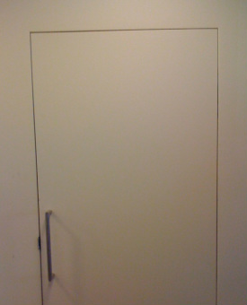 Minimalist Door Detail Although less is visible, it takes more time to detail and skilled craftsmanship to deliver a superior product. I tried this minimalist approach recently on a project on Telegraph Hill in San Francisco. When you look at this photo of the trimless flush installed door, what you see is not just the plane of the wall and door, but suddenly the joint separating the wall and door presents itself. In this case it is straight, parallel, and crisp. I wouldn't have attempted this without the help of a master craftsman - Kenji. I'm thrilled with the result and so is my client.  Kenji san Kenji is from Japan and is a master Japanese carpenter and furniture builder. His work is second to none. Thanks Kenji. Balance the Light4/9/2011 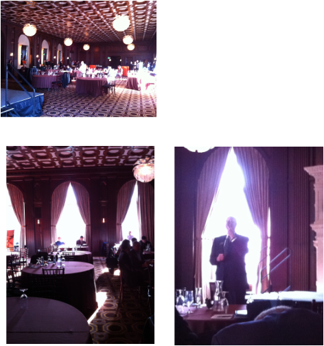 The Julia Morgan Ballroom 465 California Street, San Francisco Light has been a fascinating topic ever since I took Dick Peters architecture class at UC Berkeley -- we built light boxes with moveable openings and shifted the "sun" around the "building" to study the different effects of light. No computer simulation then! Balancing the light is almost always a good idea, particularly when visual clarity is important. I've been in the Julia Morgan Ballroom at least two times before. As I entered for the third time, I immediately remembered the problem of lighting a space like this. It's large and ornately detailed with dark paneling - heavily draped windows on the south and west. In the top photo, notice the very strong natural light from the south facing windows producing blinding spots of light. In the ballroom above, there is no balancing natural light from the north side and an insignificant amount on the west side. The artificial lighting is too meager to compensate for the cavernous dark interiors. See how the speaker is backlit and it's almost impossible to see his face. I wonder if this is how Ms. Julia Morgan originally designed the space? It's nice to think that perhaps the arches on the north side of the space were once windows. 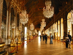 Hall of Mirrors - Palace of Versailles This problem was luxuriously solved over 300 years ago in the Hall of Mirrors at Versailles. Large arched mirrors were installed equal and opposite to the wall of windows. I guess Louis XIV had a good architect (Jules Hardouin-Mansart). Pine Street Remodel -001 Letting Go4/9/2011 Here is a sketch and photo of the existing conditions. 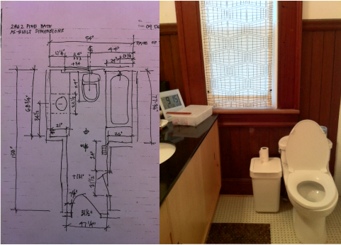 The only thing original in the room is the wood wainscot. It was stripped of many layers of paint in 1975 when I first bought the house. The result was a fairly dull slightly damaged brown surface. Years later, we had it stained and varnished to try and improve the appearance, but it wasn't much of an improvement. 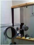 Hello Husband Chris has been patient with my attachment to the "original" wainscot although a few years ago she sent me a message by painting a small section white. Well I guess I'm ready now. The wainscot is going to go. The wainscot is old clear heart redwood so it would be a shame to just trash it. Maybe the backside is in pristine condition and we could use it another way? Stay tuned. Open the Door4/8/2011 Friday Got a garage? You've got a cafe. That's what Vega Cafe is. 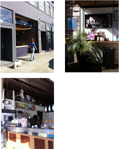 Create your cafe by opening your garage door! That's Vega Cafe. No problem telling if it open or closed. If its open it's open. Busy Folsom Street doesn't get a lot of foot traffic, but there's usually a parking space close by. I stop here regularly on my way to work for my Americano and Blue Bottle Coffee. Great guys work there and the coffee is the best! AuthorThe Ahn-Mock Family blog. Feel free to comment. ArchivesCategories
All
|
 RSS Feed
